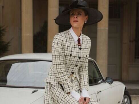


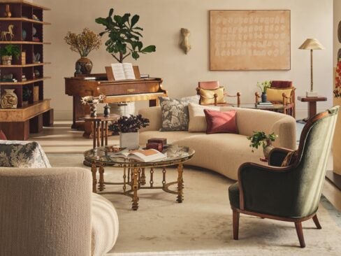
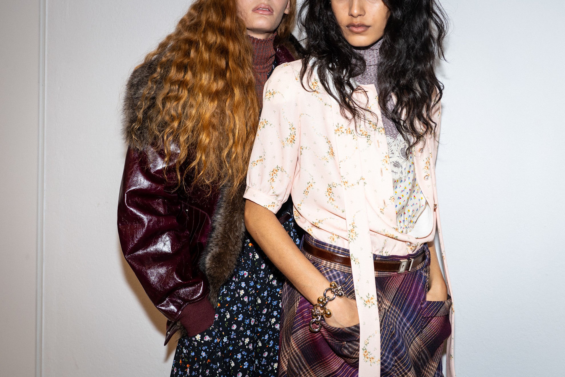
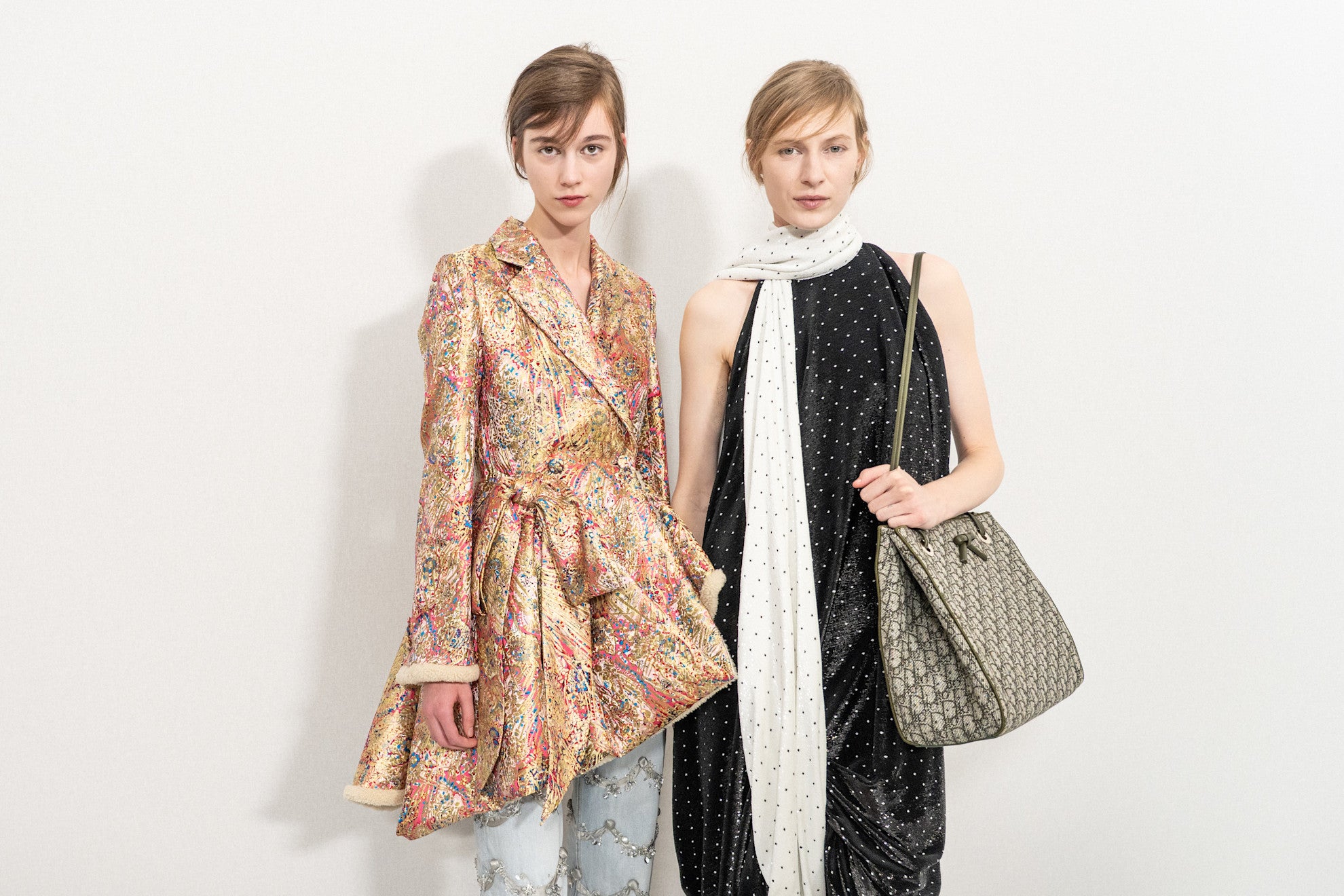
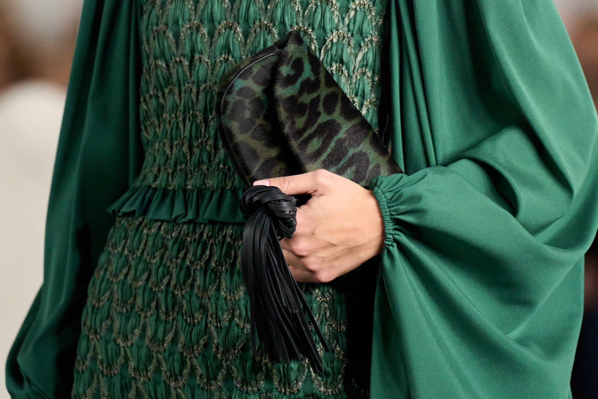
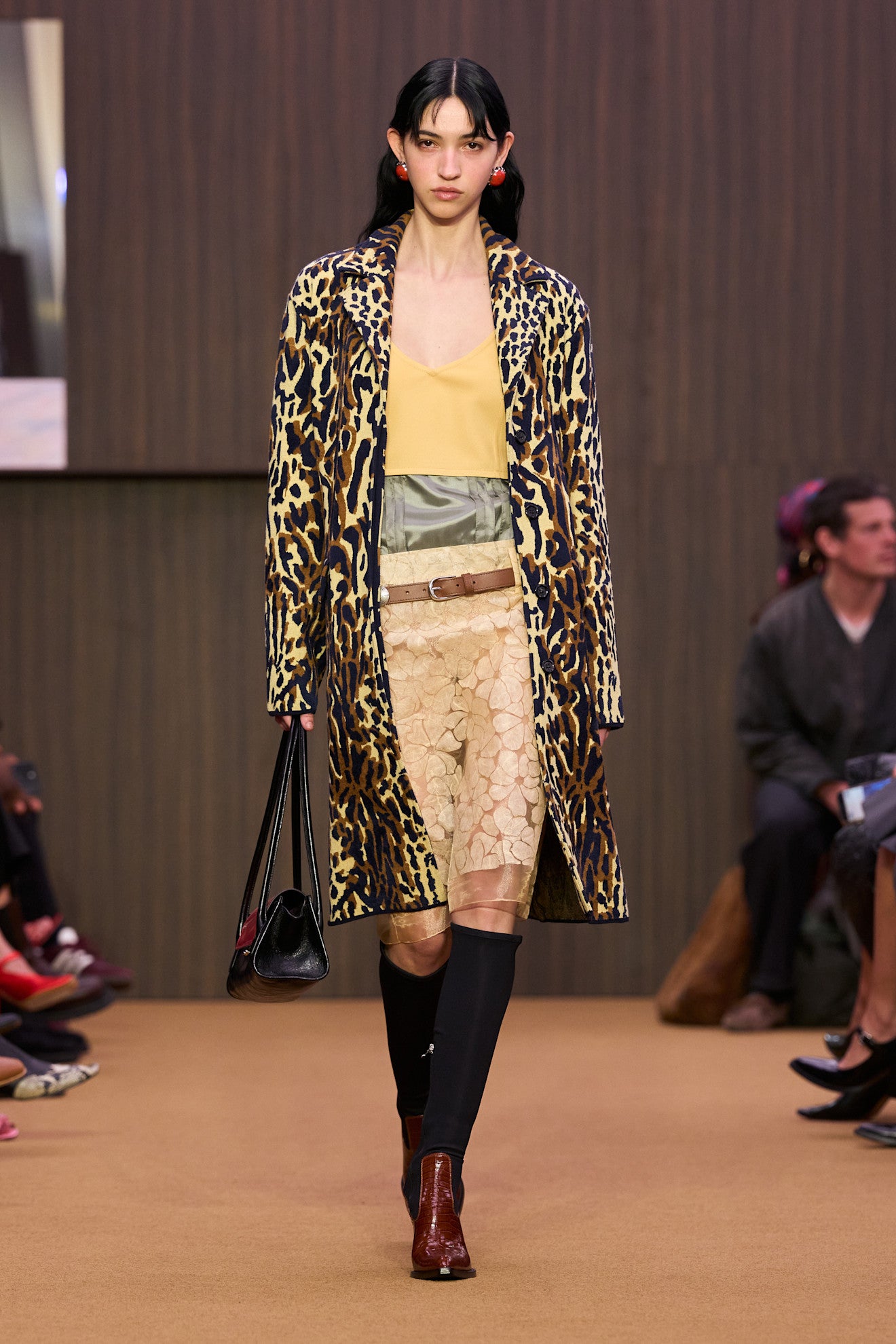
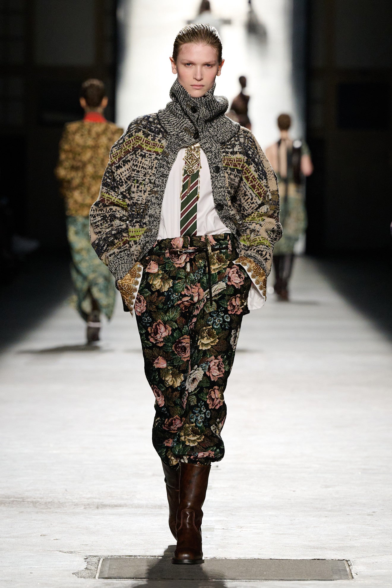
Clashing prints divide opinion. Are they bold and playful, or simply too much? Indeed, maximalism and minimalism are often framed as opposing forces in fashion — one loud and expressive, the other restrained and elegant. But where in that spectrum does chicness, the highest compliment paid for any outfit, fall?
Traditionally, the idea of chic has been shaped by a minimalist lineage – think Audrey Hepburn, Kate Moss, and Carolyn Bessette-Kennedy. But a new generation of style icons, from Billy Porter to Kim Kardashian and Keke Palmer, are rewriting the rules, dressing with gusto across red carpets and beyond.
As a major trend within the maximalist community, clashing prints have always been embraced, but do they still hold their place today? We asked stylist Florence Strickland and Copenhagen 'It girl' Josefine Meyer for their take.
See also: 8 Rollnecks That Capture Carolyn Bessette-Kennedy’s New York Elegance
For clashing prints
Florence Strickland, stylist
Perhaps we should reframe the question as one which asks us if we’re ready to break the cozy, quiet luxury mould which so safely cocoons so many of us. When I hear people talking about clashing prints, I worry there’s a common perception (or misconception) that in wearing multiple patterns, one automatically conjures a sense of discord. Sure, it could be perceived as atonal or even improvised, but wearing clashing prints is most importantly unique. With my clients, I reason that they’re sourcing patterns which, when strategically placed side by side, sing.
The collagist approach to getting dressed might involve some thought, but more crucially requires confidence. In a world occupied by aesthetic homogeny favoring elevated basics, muted tones, and the harmony of getting dressed, how many of us are brave enough to be atonal? Clashing prints have always been chic, because confidence is chic. Wear anything with enough conviction, and you have my vote.
See also: The Royal Family’s Secret Weapon? Fashion
Against clashing prints
Josefine Meyer, fashion influencer
I’ve never seen myself as a minimalist per say, and I love experimenting with colors, patterns, prints – I would like to do it even more. But when it comes to the debate on clashing prints, I usually find that 'less is more'.
To me, there is a unique power in a look that doesn’t necessarily shout for attention. When too many patterns start fighting for space, the different pieces of clothes and the person wearing them get lost in the noise. I prefer a beautiful co-ord or a high-quality fabric to take all the attention in a quiet and elegant way.
If we look at a very current and classic icon, like Carolyn Bessette-Kennedy, her style wasn’t iconic because it was loud, it was iconic because it felt intentional and timeless. A clashing print often feels like a fleeting trend that dates itself the moment the season is over, whereas a more harmonious look carries a natural feel and professional edge. I’m all for pushing boundaries with new shades, but I prefer a quiet confidence look.